

Cafe 41 Logo Redesign – Case Study
- Graphics
This project is a conceptual redesign of Cafe 41, a cozy neighborhood café. The goal was to create a logo that reflects the café’s welcoming atmosphere while incorporating playful elements that make it stand out.
The interior features red as an accent color, which became a key element in the logo redesign.
Design Objectives
Incorporate Red to align with the café’s existing interior aesthetics.
Blend Typography & Graphics to create a playful yet minimal logo.
Maintain a Simple & Modern Look that feels inviting and timeless.
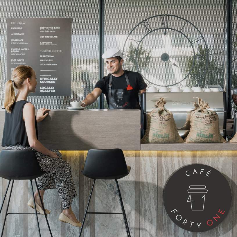
The redesigned logo integrates a paper coffee cup with the number “41” in a unique and clever way, enhancing brand recognition and playfulness.
Key Features:
Minimal Line Graphics
Ensures clarity and versatility across different branding materials.
Typography Alignment
A carefully selected typeface complements the graphic’s sleek and modern aesthetic.
Playful Integration
The “41” is seamlessly incorporated into the coffee cup illustration, reinforcing the café’s identity in a visually engaging way.