

VIVINO – UI/UX Case Study
- UI/UX design

Revamping Vivino: A transformative leap from light to dark mode, elevating wine enthusiasts’ experience with a sleek, user-centric redesign.
Vivino is a globally recognized wine app and marketplace that provides wine enthusiasts with extensive information on various wines, enabling them to enjoy their wine to the fullest. As an avid wine lover, I never walk into a wine store without using the Vivino Wine Scanner app. While there are other wine label scanning apps, Vivino stands out for its user-friendly interface and rich, detailed wine information.
Project Summary
In this individual college project, my main objective is to carefully analyze the Wine Details page’s UX and UI design to address key user experience problems, enhance overall usability, and align the design with users’ and business goals.
Individual college redesign project
Three weeks in Q4 2022
UX research / User flow / Wireframe
UI mockups / Prototype
The Problem
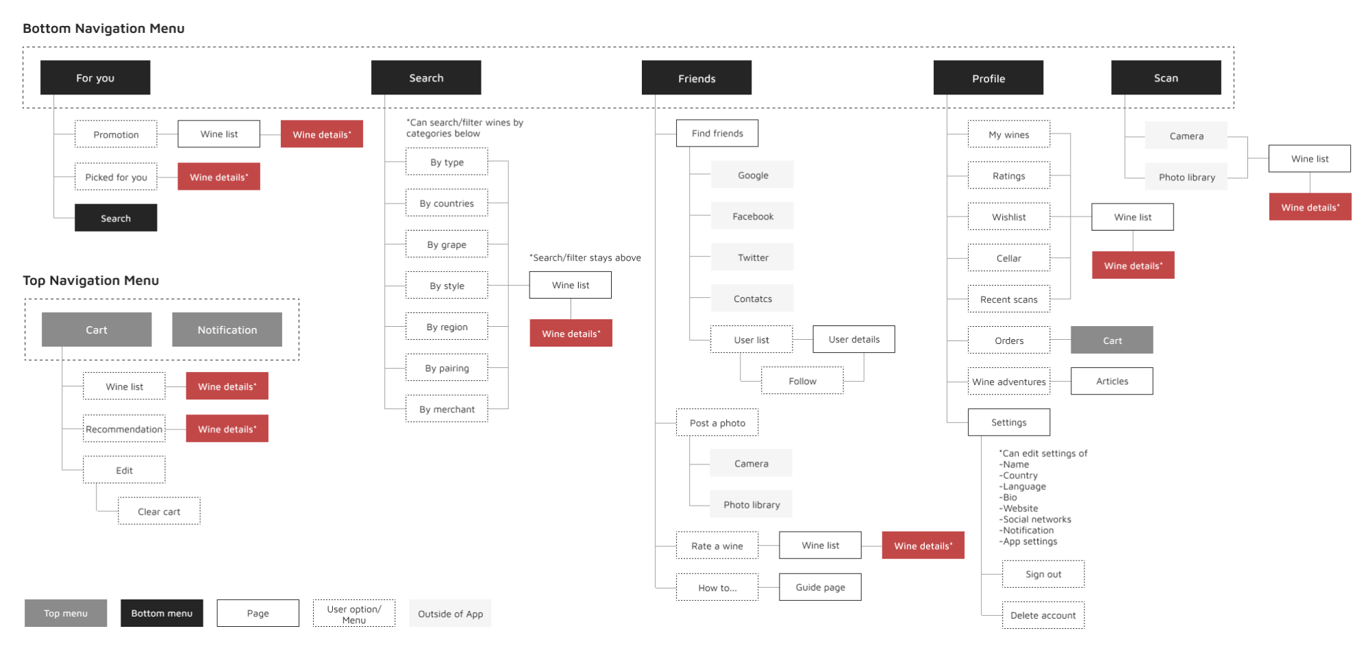
The current user flow in Vivino’s app is relatively straightforward, with the Wine Details page being the central screen that is accessible from various points within the app, as you can see the current user flow below. This page is the app’s primary feature and displays a wealth of information about each wine, which can make it quite overwhelming for users.
Current user flow
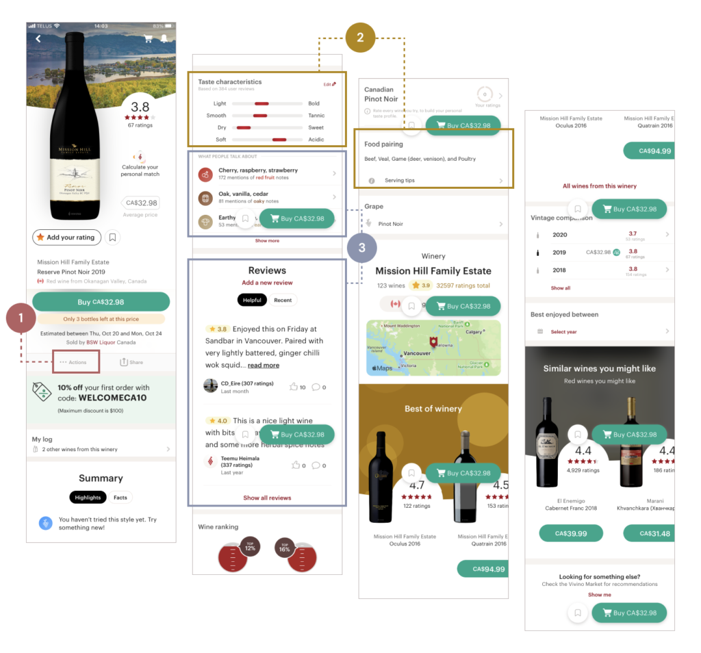
Given the vast amount of information that Vivino offers, its pages can sometimes feel crowded and overwhelming as the current wine details page shows.
Current wine details page
Identifying the main pain points in the user experience, I focused on three key areas:
- Poor visibility of “Actions” menu
- During usability testing, it was observed that most users didn’t notice the “Actions” menu which provides various options. The current design of the menu, with small size and light grey text, makes it difficult for users to find and utilize all of the available actions.
- Disconnection between taste and food pairing information
- Wine enthusiasts are interested in each wine’s characteristics and enjoy pairing it with food. However, the current placement of taste and food pairing information is separate from each other, which could be frustrating for users who want to access this information quickly.
- Hidden valuable reviews
- The placement of valuable reviews related to wine’s personality is outside of the “Reviews” section, which means that many people miss them. Grouping related content together logically is crucial, especially in this type of text-heavy page.
Project Goals
Enhance the page’s UX/UI design to address identified user experience problems
Align the design with users’ and business goals
Simplify navigation and information discovery
Solutions
While a light background is often seen as the safer choice for UI design, I was drawn to the idea of experimenting with a dark mode for Vivino. I believe that a black-background UI can be dramatic, stylish, and elegant, particularly in the right context and environment. And what better context than a wine app?
I was excited to take on the challenge of redesigning Vivino’s UI in a dark mode, and I believe that the result is a visually striking and user-friendly interface that enhances the overall experience for wine lovers everywhere.
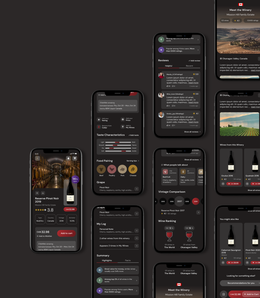
Key improvements
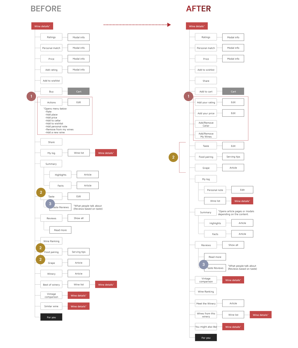
1, Improve visibility of “Actions” menu
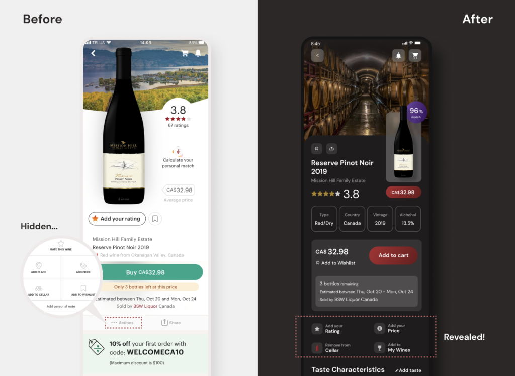
To improve the visibility of “Actions”, the menu has been made more prominent with clear labels and intuitive icons. This will make it easier for users to discover and use all of the available features.
2, Prioritize useful information
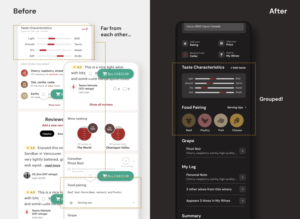
To solve the problem of disconnection between taste and food pairing information, they have been placed together toward the beginning of the page. This will help users quickly and easily access the information they need most, while also reducing clutter and improving the overall user experience.
3, Group related contents together
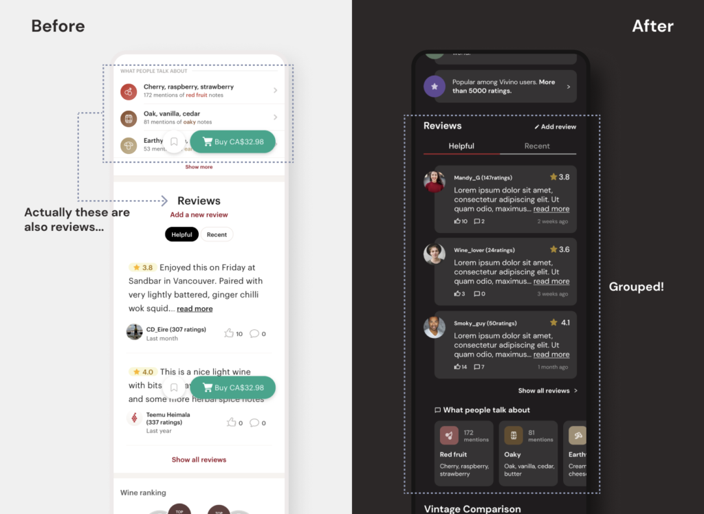
To make hidden valuable reviews more recognized, the Taste Reviews section has been placed within the Reviews section, as it is a subset of that content. This will help users more easily understand the relationships between different types of content on the page, and prevent them from missing the valuable information.
Measuring Success
To measure the success of the proposed improvements and evaluate their impact on user satisfaction and overall product experience, I would track the following metrics, if resources were available:
- User engagement with the “Actions” menu
- Time spent on the Wine Details page
- The number of users who interact with Taste Reviews and food pairing sections
Branding
Inspired by the perfect geometric shape of the Vivino logo, I chose DM Sans as the primary typeface for this project. This low-contrast, geometric sans-serif typeface is designed for smaller text sizes and comes in a range of styles, including regular, medium, and bold with matching italics.
Key branding elements:
- Typeface
- DM Sans for high legibility and accessibility
- Color choices
- Preserved elements of Vivino’s current branding, added gradients to the primary red, and refined secondary colors for a subtle smoky quality
- Custom icons
- Designed a cohesive set of filled-shape icons with clean lines, echoing the filled-in logo’s aesthetic

Conclusion
In conclusion, I took on the challenge of improving the user experience and interface design of Vivino’s Wine Details page by carefully analyzing its UX and UI design. The main screen is a busy and text-heavy page that can be overwhelming for users, so I sought to create a more functional and aesthetically pleasing design that would allow for easier navigation and information discovery.
Key accomplishments:
- Dark Mode and UX Enhancements
- Implemented a dark mode along with UX improvements to create an intuitive and enjoyable wine exploration experience for users.
- Usability Testing and Feedback
- Engaged in usability testing and interviews with fellow wine enthusiasts, gathering valuable feedback to further refine and enhance the redesign.
- Striking and User-Friendly Interface
- Successfully achieved a visually striking, user-friendly interface that elevates the overall experience of the app for wine lovers everywhere.