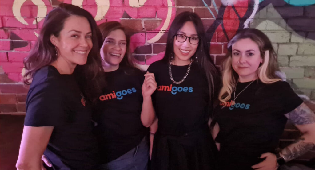
amigoes – Design System
- UI/UX design
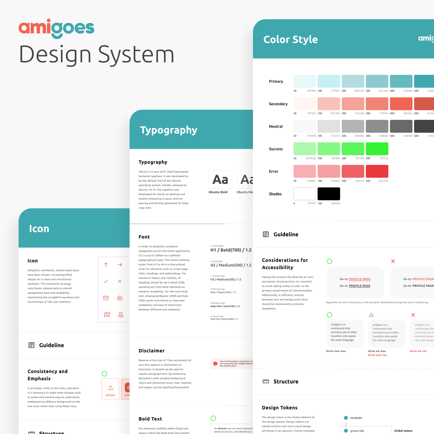
Crafting amigoes’ Design System: A Harmonious Blend of Style, UI Kits, and User Guide
In developing the amigoes app, one of my main responsibilities was to create a detailed design system. My goal was to make the user experience attractive, easy to understand, and consistent across the app.
This design system became our team’s go-to guide. It included all the design rules, style guides, and reusable components we needed.
Having seen how a design system can make a project run more smoothly and keep the design consistent, I plan to contribute to the design system in all my future projects.
Developing the amigoes Style Guide
The style guide is the backbone of any design system. It encapsulates the visual identity of the product, serving as the rule book for its colors, typography, and iconography, and ensuring visual consistency across all screens and states. My process for developing the amigoes style guide was meticulous, involving several crucial stages:
Trend Research
Conducted extensive design trend analysis, particularly for apps catering to senior users.
Competitor Analysis
Evaluated aesthetics of competitor apps to understand sector-specific design language.
User Interviews
Undertook user interviews to understand visual preferences and potential visual impairments of our elderly target demographic.
Findings
Colors
Contrary to our initial assumption, we found that senior users have a preference for bright and vibrant colors over calmer hues. This insight greatly influenced our color palette, shaping amigoes into an app that resonates visually with our audience.
Typography
The feedback we received indicated a clear preference for sans-serif typefaces among our target users. In response, we selected clean, sans-serif fonts to ensure optimal legibility across all screen sizes and devices.
Iconography
Our study revealed that elderly users can more easily identify and interact with outline icons as compared to solid ones. This led us to adopt an outline style for all app icons, making them more accessible and intuitive for our users.
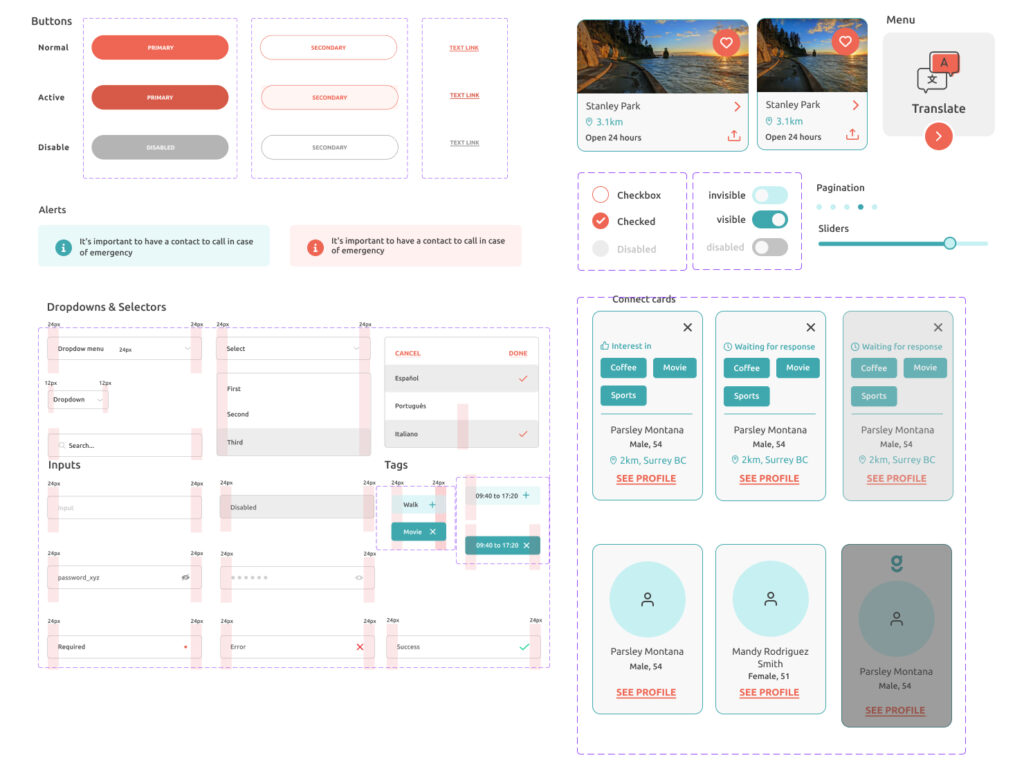
Building UI Kits for amigoes
UI kits are essentially the building blocks of our app interface. They include buttons, checkboxes, cards, and any other components that we use repeatedly across different screens.
We meticulously designed these elements for amigoes, ensuring they’re not just visually appealing and consistent with our style guide, but also intuitive and easy to use for our target users – the elderly.
Examples of amigoes components
Creating the amigoes Design Guide
The design guide is essentially a manual for using the design system. It provides guidelines on when and how to use various components, ensuring design consistency while still allowing for flexibility where needed.
For amigoes, we made sure our design guide is comprehensive and clear, so that any member of the team could easily understand and implement our design system.
Here are some examples:
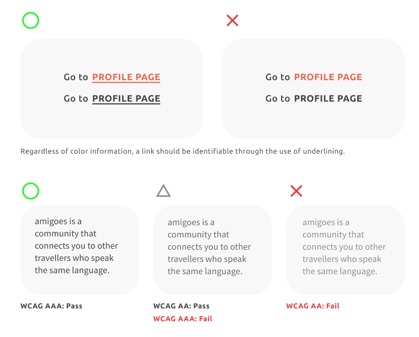
Considerations for Accessibility
Taking into account the diversity of color perception characteristics, it’s essential to avoid relying solely on color as the primary visual means of communication. Additionally, a sufficient contrast between text and background colors should be maintained to enhance readability.
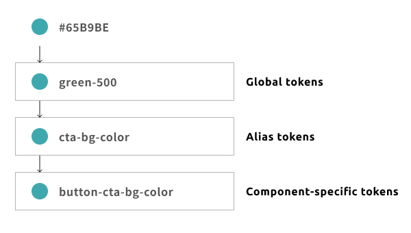
Design Tokens
The design token is the tiniest element of the design system. Design tokens are named entities that store visual design attributes in an agnostic, human-readable abstraction of visual styles that sync with all the style files in the system. This allows you to create a scalable and consistent visual system for UI development.
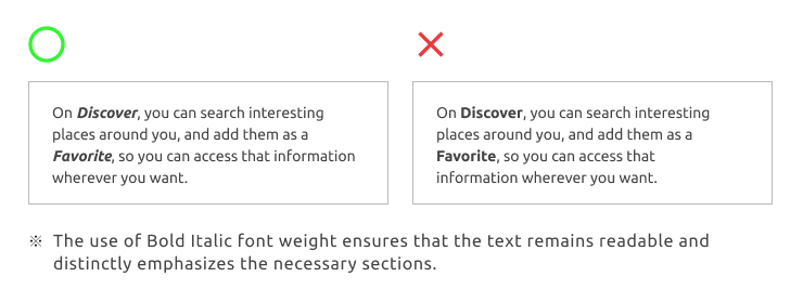
Bold Text
For enhanced visibility within body text, always utilize the Bold Italic font weight when applying bold styling. This will generate a striking contrast with the rest of the text, ensuring the bolded elements are distinct and eye-catching.
Conclusion
The process of creating a design system for amigoes gave me a lot of precious insights.
Not only did they help create an aesthetically pleasing interface, but they also guided me to a design that is intuitive, accessible, and friendly for our elderly users.
In this way, I was able to align the visual identity of amigoes closely with its core mission: fostering connections and enhancing experiences for elder visitors and immigrants.