

Fickl – UI/UX Case Study
- UI/UX design
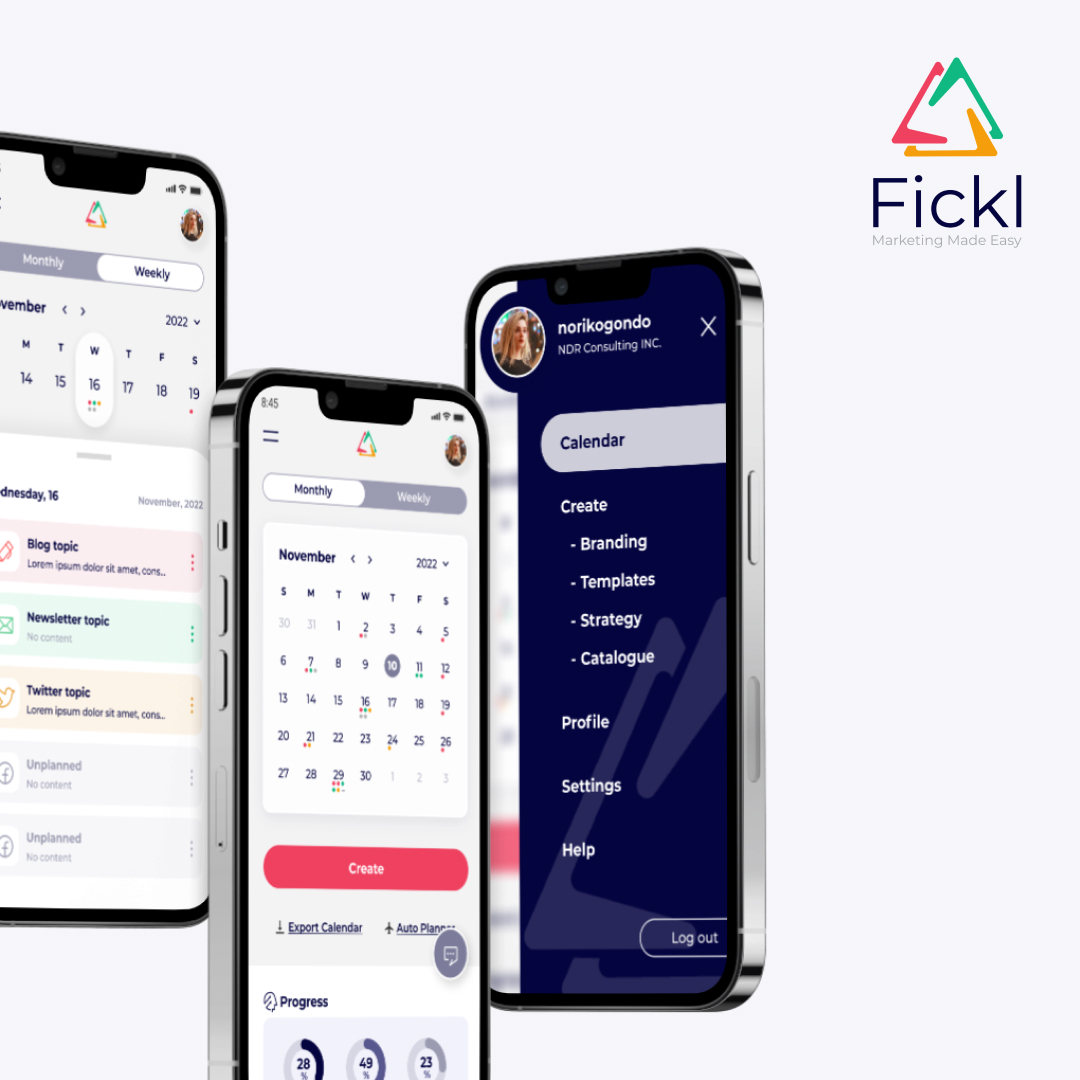
Revitalizing Fickl: A seamless transition to mobile, enhancing the user experience and interface for effortless marketing content management on-the-go.
Fickl is a SaaS application that empowers users to seamlessly schedule social media posts, craft engaging email newsletters, compose compelling blog content, and store print marketing materials, all within the Fickl marketing calendar. I was tasked by the founder of Fickl to create sample mobile screens for their application, which previously only had desktop screens. The goal was to improve both the user experience (UX) and interface (UI) while maintaining their brand identity.
An individual project tasked by the founder
Two weeks in Q4 2022
A brand-new solution for mobile
UX research / UI mockups / Prototype
The Problem
The desktop version had two similar calendars side by side, causing confusion. Additionally, the main feature of creating marketing plans was hidden in the “Settings” menu, which was not intuitive for users as “Settings” generally refers to account settings. The UI design may appear less captivating due to the monochromatic color scheme and extensive use of negative space.
Note : Due to the sensitive nature of the client’s work and the unavailability of free plan access to view the application screens, I am unable to share the actual previous design screens.
Improvements
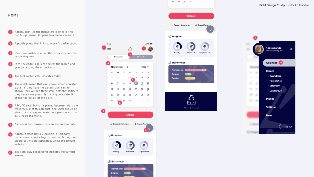
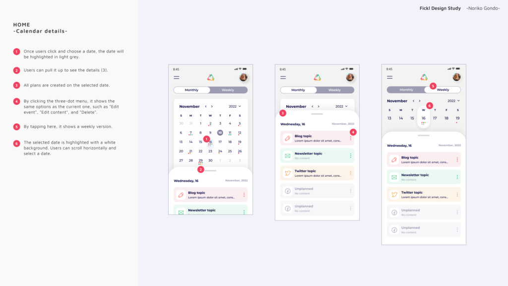
Streamlined Calendars
I created a monthly and a weekly calendar option and enabled users to switch between them using tabs. This improved usability and reduced confusion.
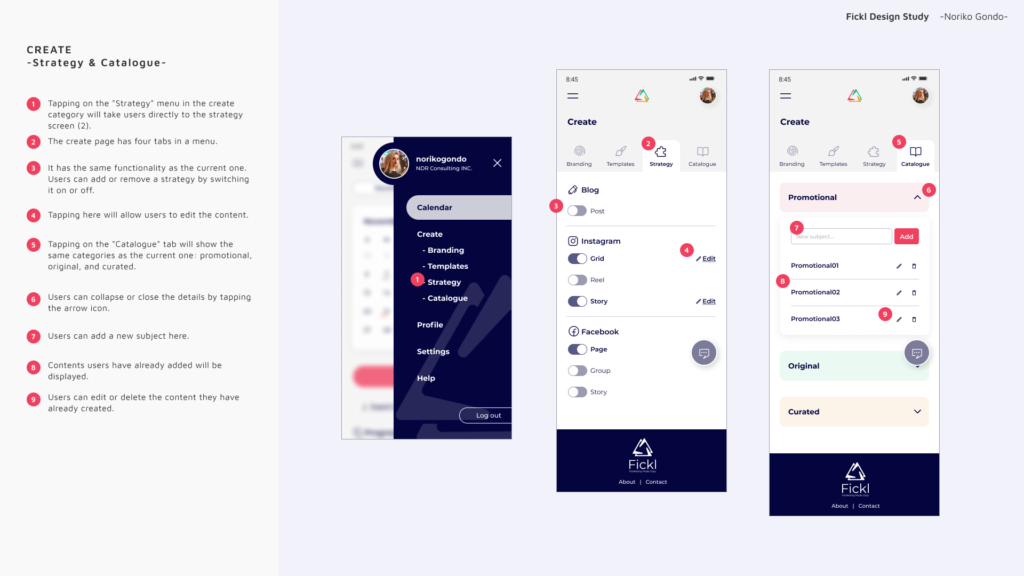
Enhanced Navigation
I created new navigation menus to improve the user experience, separating the main feature menu (“Create”) from the “Settings” menu. This ensured that the main functionality was easily accessible to users.
Engaging Design
I incorporated the branding color scheme to add more colors and rhythm to the design, making it visually engaging. I also used clean and minimal icons to make it intuitive for users to understand where to go.
Wireframe

Notes for developers
Measuring Success
To evaluate the success of the implemented UX/UI improvements in the Fickl case study and to reflect on product thinking, the following metrics could be tracked:
- User Engagement
- Monitor how users interact with the updated navigation and calendar features, such as switching between the monthly and weekly views, and using the main “Create” functionality.
- Task Completion Time
- Measure the time it takes for users to create and schedule marketing content using the new interface, with a focus on reducing the time required to complete these tasks.
- User Satisfaction
- Conduct user surveys or interviews to gauge user satisfaction with the updated design and its impact on their overall experience using Fickl’s application.
- Retention Rates
- Track the retention rates of users to understand if the improved UX/UI design leads to an increase in the number of users who continue to use the app over time.
By monitoring these metrics, the impact of the design improvements on the Fickl application can be better understood, helping to further refine and optimize the product to meet the needs of its users.
Conclusion
The improved design for Fickl’s application focused on enhancing the user experience and interface by addressing the challenges of confusing calendars and hidden main functionality in the “Settings” menu. The updated design features streamlined calendars, improved navigation, and an engaging visual design, resulting in a more user-friendly and visually appealing application.
The feedback I received from the founder was largely positive. In particular, they appreciated the way I organized the monthly and weekly calendar, as well as the prominent button that directs users to the app’s main feature, which is creating marketing plans. Receiving such positive feedback was incredibly rewarding, and it has further motivated me to continue creating impactful solutions for both businesses and individuals.