GUEST ME – Design System
- UI/UX design
Introducing the design system of GUEST ME, a responsive platform connecting guest speakers with educational organizations. As the lead designer of this project, I developed a comprehensive design system that ensured consistency and cohesiveness throughout the platform. The system includes guidelines for typography, font and logo usage, and UI components that helped to create a delightful and user-friendly experience for both speakers and organizations. To explore the full scope of the project and its design system, please visit here!
Typography
Typeface
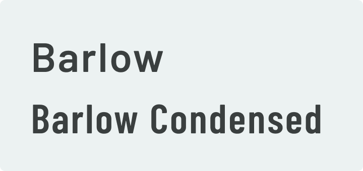
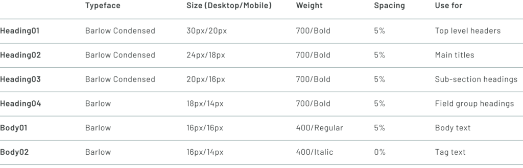
GUEST ME uses two Google fonts, Barlow and Barlow Condensed, which are used throughout the platform for branding, such as the logo, headings, body, and buttons. Barlow is a highly versatile typeface, described as a slightly rounded, low-contrast, grotesque type family that strikes a balance between friendliness and functionality. With its multiple weights and styles, Barlow is perfect for complex websites and app interfaces as both a text and display font. It is ideal for supporting complex information hierarchies, especially for text-heavy projects, due to its ability to provide visual contrast and clarity. The use of Barlow and Barlow Condensed in GUEST ME’s design system ensures a consistent and cohesive visual identity across the platform.
Font Usage
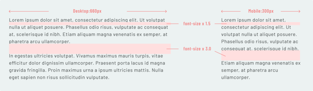
Line Height & Margins
At GUEST ME, we believe that good design is not just about aesthetics, but also about functionality and usability. To ensure a pleasant reading experience and optimal legibility, we pay careful attention to the line height and margins of our content. For instance, when displaying content in a fluid layout, we set a maximum width of 660 pixels, which allows the container to expand evenly with consistent margins on either side. This approach helps to maintain a clean and organized look, while also ensuring that the content remains readable and accessible on a variety of devices and screen sizes. Whether you’re browsing on a desktop, tablet, or smartphone, you can count on GUEST ME to deliver a smooth and seamless user experience.
Color
Logo
Color & Space
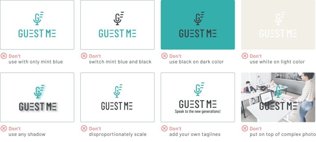
At GUEST ME, we take great care to ensure that our brand identity is conveyed consistently across all platforms. Our logos are a key part of our brand identity, and we have created a set of guidelines for their use. The GUEST ME logo is available in three color schemes: the combination of mint blue and black, black, and white. These color schemes work best on specific backgrounds. For example, the combination of mint blue and black, and the black version, work best on a white or light background, while the white version should be used on dark backgrounds.
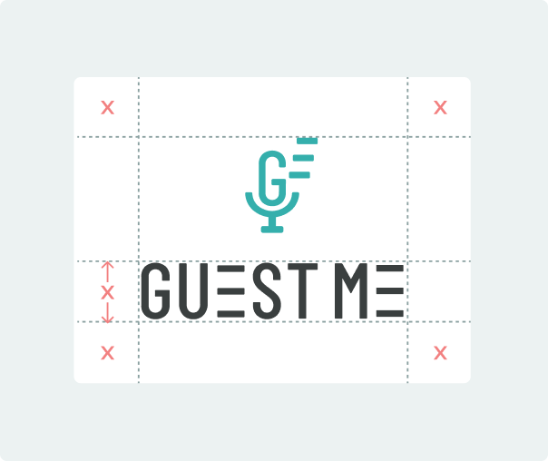
In addition to our color guidelines, we have established specific rules for spacing around our logo. The logo should always be separated from other visual elements by a distance equal to the height of “GUEST ME”. We call this distance the area of isolation, or clear space, and it should be adhered to in most situations. By maintaining consistent clear space around the logo, we can ensure that it is always visible and legible, and that our brand is represented in the best possible way.
Variation Examples

Things to Avoid
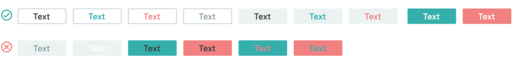
To ensure brand consistency and preserve the integrity of the GUEST ME logo, it is important to use it correctly and avoid any misuse. Please only use the logo in the appropriate colors from our color palette, as specified in the guidelines. Below are some examples of what to avoid when using the logo to maintain its visual identity and recognition.
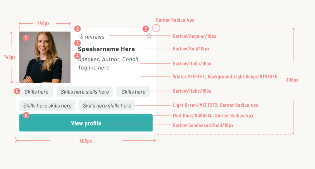
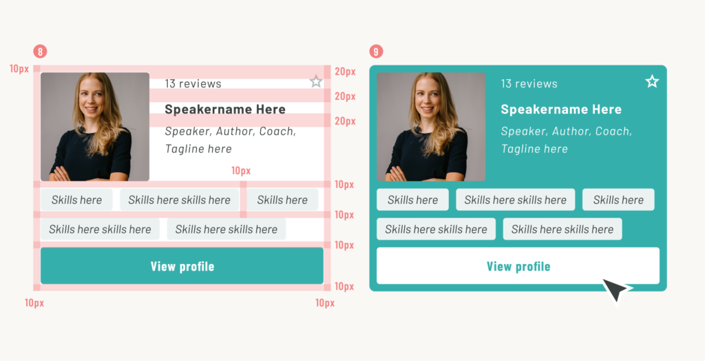
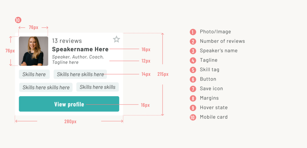
Component
Speaker Detail Card