Toronto Cupcake – UI/UX Case Study
- UI/UX design
This is my UI/UX re-design case study for a bakery shop, Toronto Cupcake. Toronto Cupcake is a popular bakery that specializes in customized branded cupcakes for corporate clients in the Greater Toronto Area. Despite having a reputation for delicious cakes and desserts, the website’s design is outdated and the navigation is cluttered with too much information.
Problem Statement
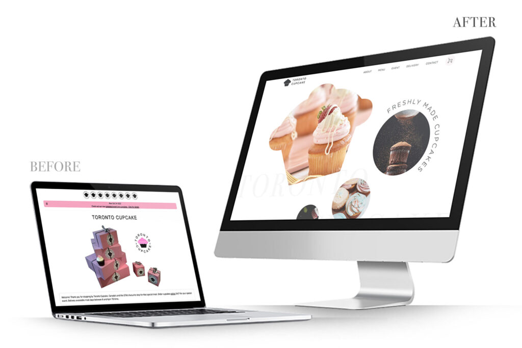
The existing website suffers from several UX issues that hinder its usability:
Confusing navigation
The website has too many links, and the bottom navigation menus lack proper hierarchy and contrast.
Poor quality photos
The photos used on the website are not edited properly and appear dark and blurry, which negatively impacts the user experience.
Wide body text
The text blocks extend to the full width of the page, with more than 100 characters per line, making it difficult to read.
Proposed Solution
To address the problems mentioned above, I propose the following solutions:
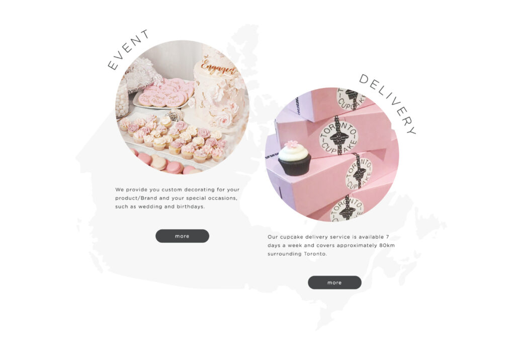
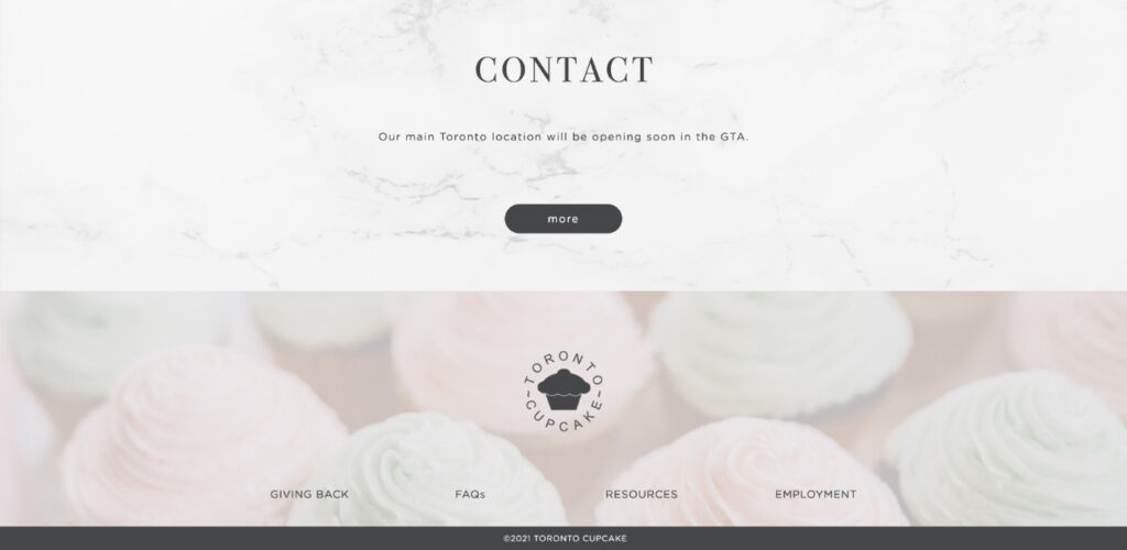
Improved UX
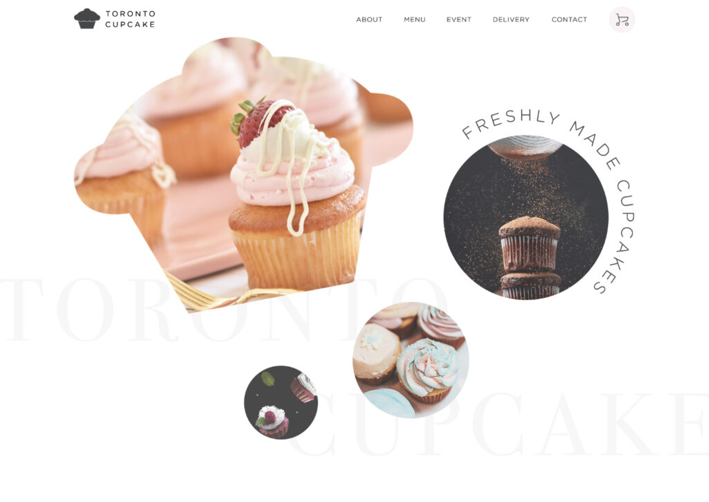
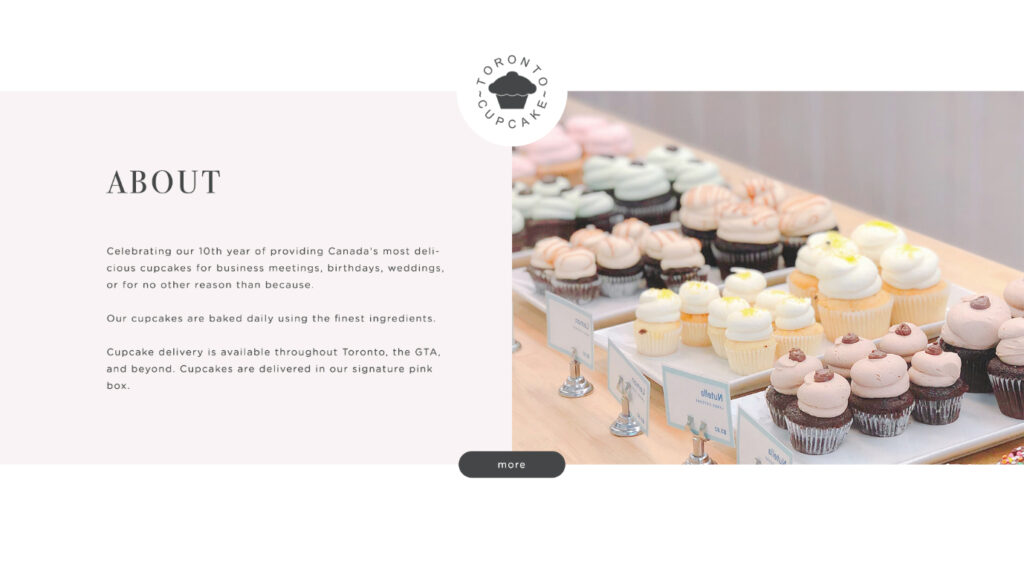
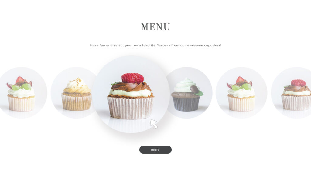
I reorganized the navigation and created a clear hierarchy in the header and footer to enhance the user experience.
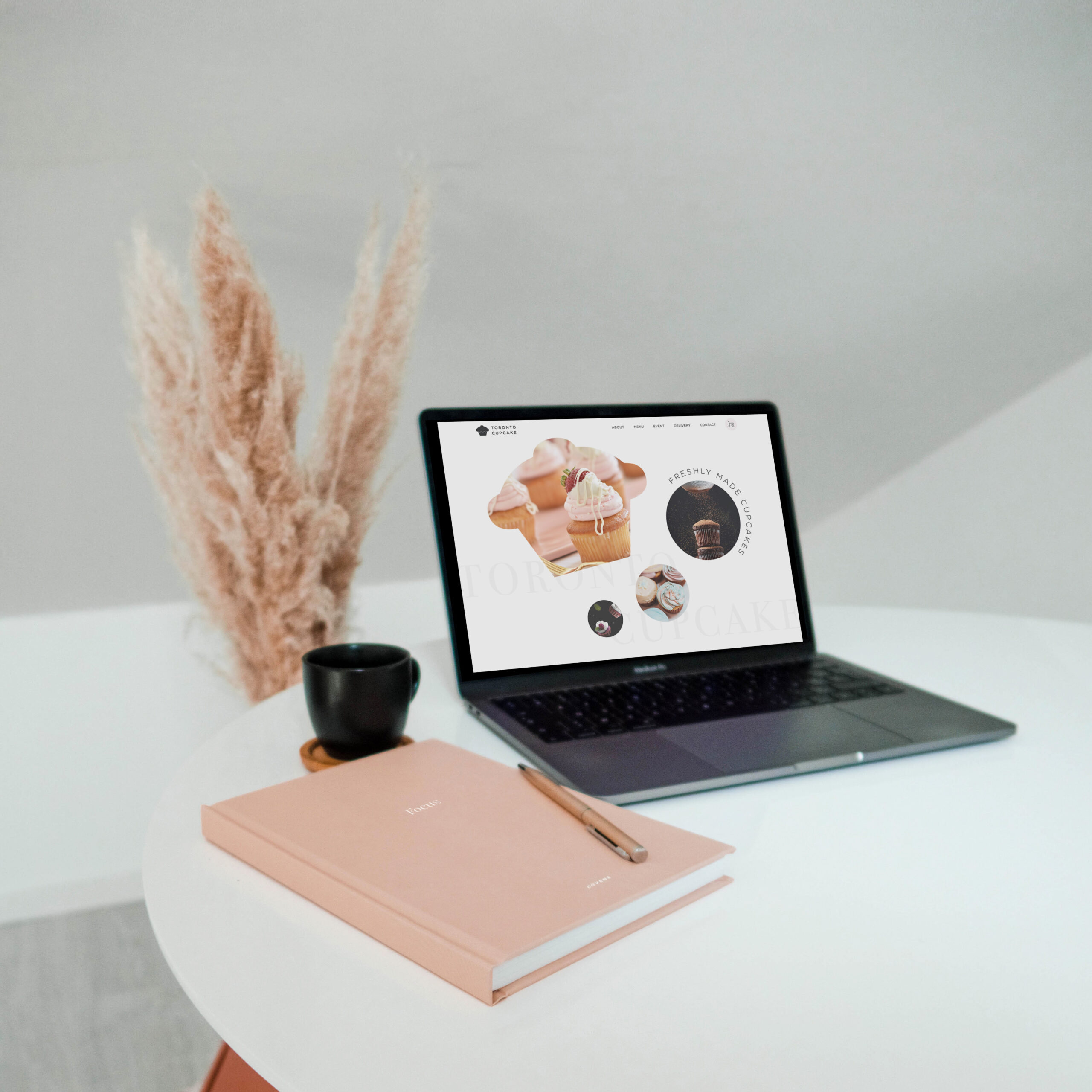
Modern design
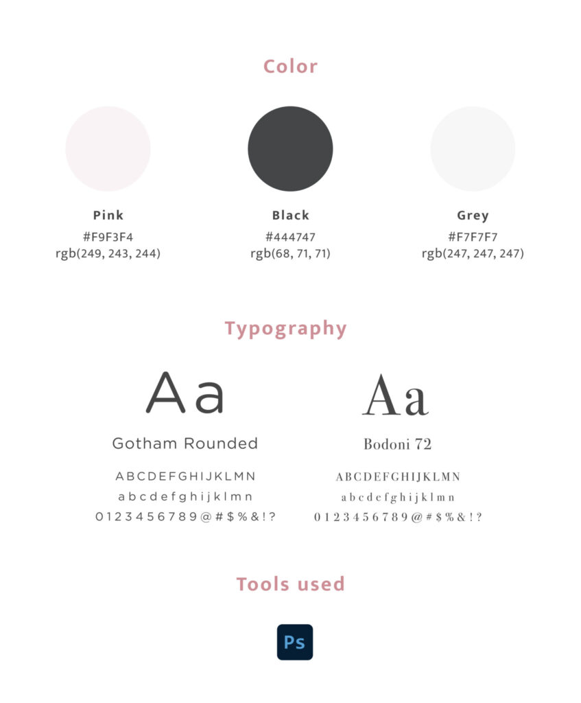
I updated the design by incorporating negative space, giving the website a luxurious and elegant feel.
High-quality images
I replaced the low-quality images with high-quality ones that are relevant to the website, thereby improving the visual appeal and user experience.
Optimal text line length
I shortened the length of the text blocks to between 45 and 80 characters per line, making it easier for users to read on desktop screens.