Vancouver Foundation – UI/UX Case Study
- UI/UX design
In this UX/UI redesign case study, I tackled the website of Vancouver Foundation, a member of Community Foundations of Canada.
This organization supports local initiatives through financial and leadership contributions from community foundations across Canada.
Given the amount of information the website needs to provide, the challenge was to create a clear and organized navigation system that would help users easily find the information they need without feeling overwhelmed or confused.
Current Website
Improving Navigation and Redundancy
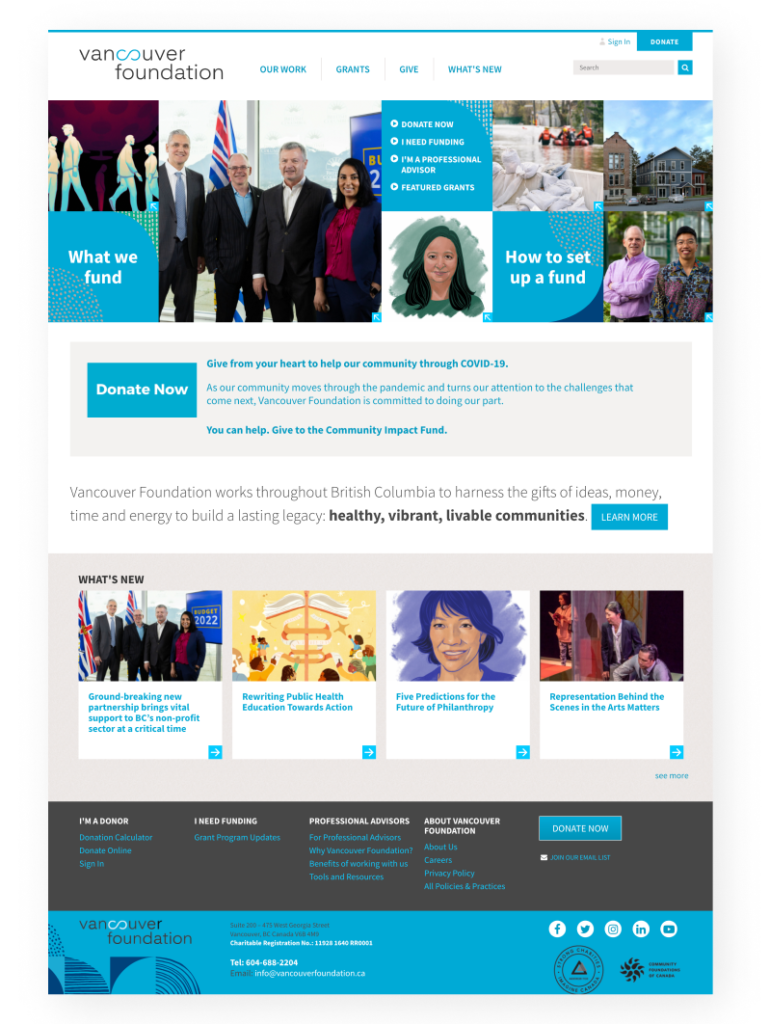
The navigation of the current website is confusing with too many links in the hero image. Moreover, some links are redundant and lead to the same page. It is important to declutter the navigation to make it easier for users to find what they are looking for.
Increasing Negative Space
One of the main issues with the current design is the lack of negative space between the elements, resulting in a cluttered and overwhelming appearance. The addition of more negative space can create breathing room and improve the overall readability and visual appeal.
Consistency in Visual Design
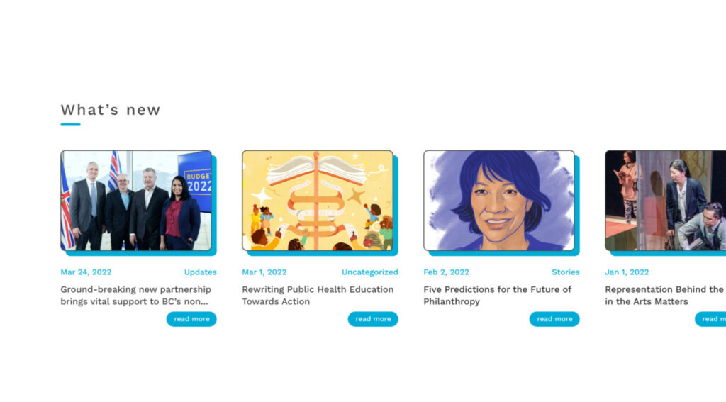
While the website includes many photos, the design does not exhibit consistency in their presentation. The use of inconsistent images can create a disjointed appearance and impact the overall user experience. A consistent approach to imagery, such as selecting images that match in style and size, can enhance the visual cohesiveness of the design.
Optimal Line Length for Text Blocks
Some of the text blocks in the current design span the full width of the page, resulting in a lengthy line length that can be difficult for users to read. Ideally, the line length of text should range between 45 to 80 characters per line to enhance the readability of the content.
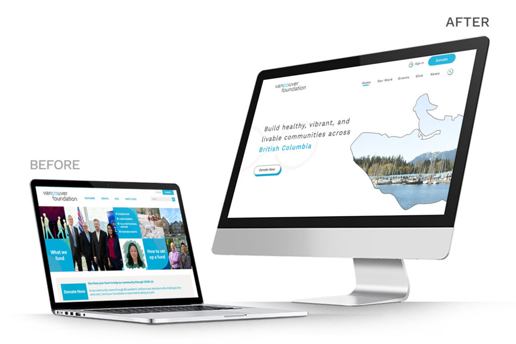
My solution
Improved UX
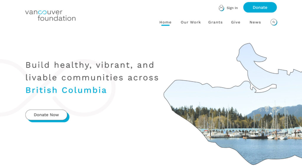
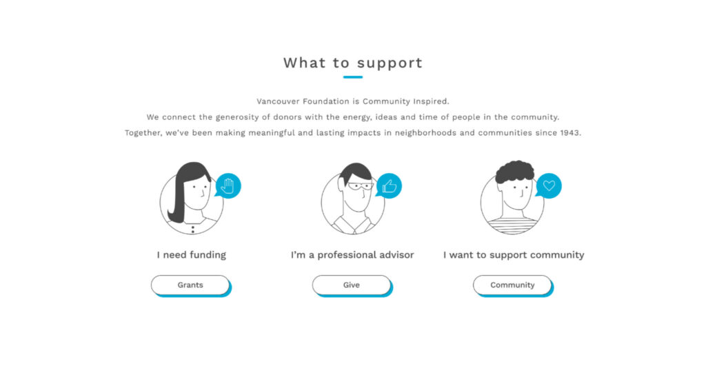
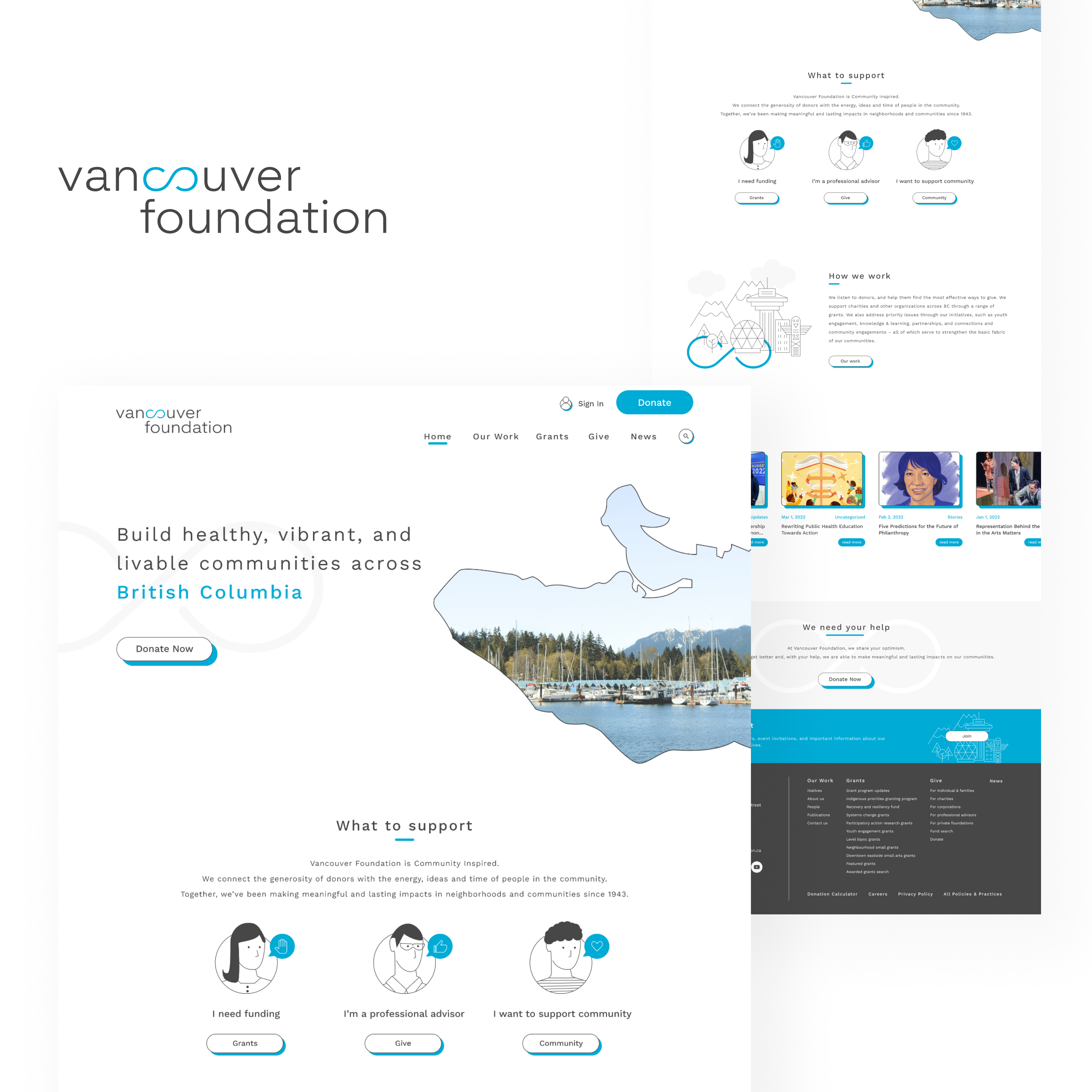
To create a more organized and intuitive user experience, I reorganized the hero image links into three clear categories, making it easier for users to find the information they need. Additionally, I removed any redundant links to avoid confusion.
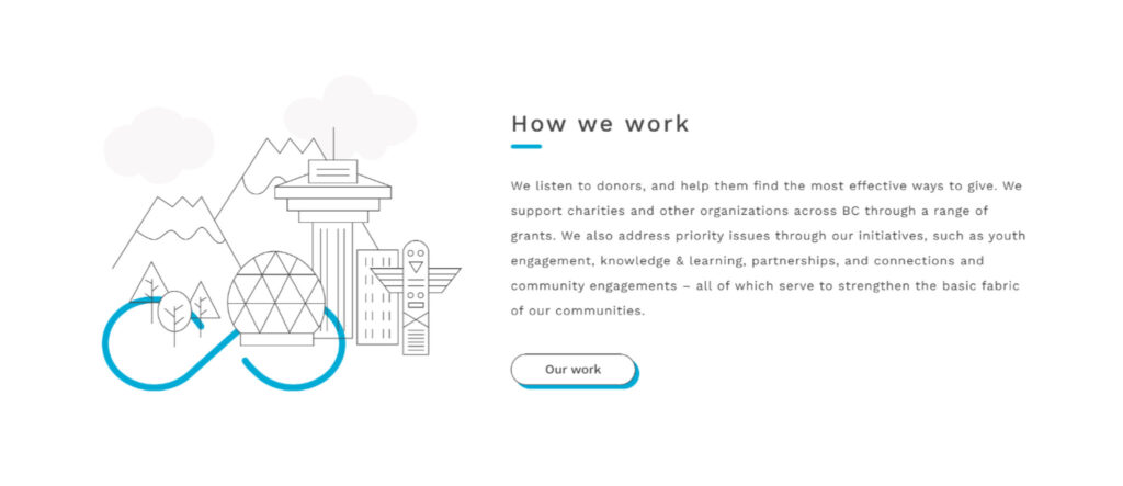
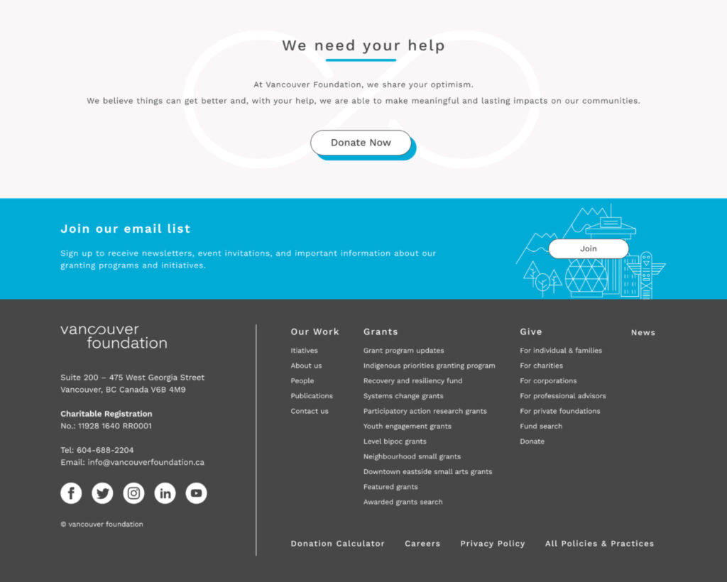
Increased White Space
To improve the visual appeal and readability of the website, I increased the amount of white space between elements. This gives the website a more sophisticated and modern look, and makes it easier for users to navigate and read the content.
Unified and Memorable Visuals
To create a more cohesive and memorable design, I used a single strong image that represents Vancouver and its community. This creates a consistent visual theme throughout the website, making it more visually appealing and engaging.
Optimized Text Line Length
To improve readability and the user experience, I adjusted the width of the body text to ensure an optimal line length of between 45-80 characters per line. This allows users to read the text more easily and efficiently, without straining their eyes or losing their place in the text.
Branding
New Design