

Sephora – UX Case Study
- UI/UX design
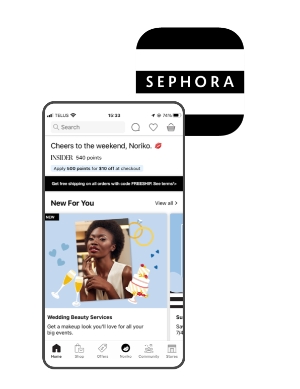
This is a UX redesign showcase for the SEPHORA app, which is a cosmetic company’s application. The SEPHORA app offers iPhone users an exciting new way to shop at Sephora and provides customers with deals on their devices. With the app, customers can purchase products, view the latest launches, access how-to video clips, read ratings and reviews, check previous purchases, access their Beauty Insider account, and create shopping lists.
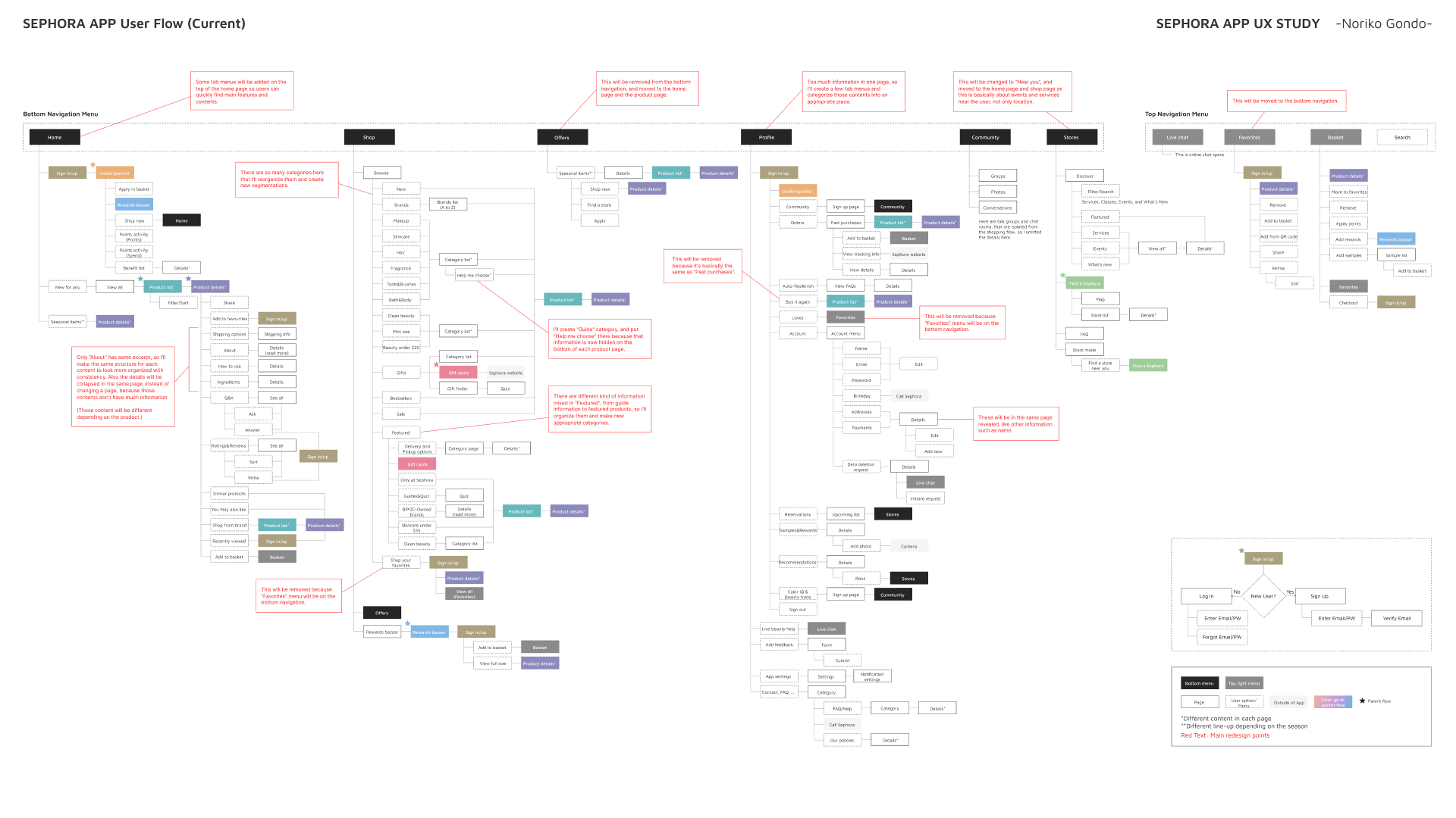
Due to the nature of the shopping app, it has a wide variety of products and options with multiple features. This can sometimes confuse users and cause eye fatigue. In this UX redesign project, I focused on improving the main screens with mixed information and inconsistent structures and hierarchy, such as the product list and details page.
My solution
Organize navigation menus
The current app has six menus on the bottom, which may be overwhelming for some users. To streamline the user experience, I reduced the number of navigation menus to five by removing redundant information.
Reveal hidden important contents
Some critical content is currently buried within deep layers of the app, making it difficult to access. To improve the user experience, I created new flows and structures to highlight important information.
Improve hierarchy and consistency
The product details page currently has many sections with different structures, which can be confusing for users. To make it more intuitive, I improved the hierarchy and consistency of the page’s structure, making it easier for users to navigate.
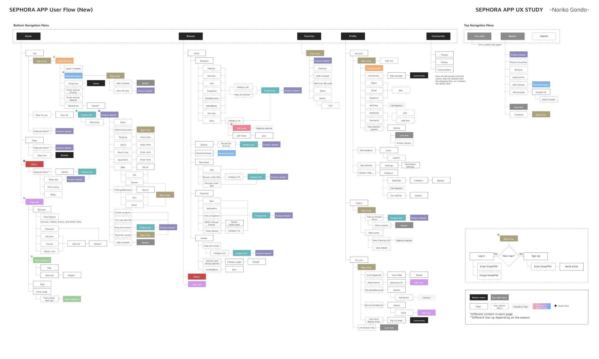
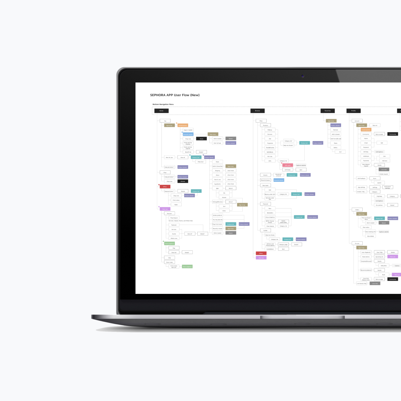
HOME & NAVIGATION MENU
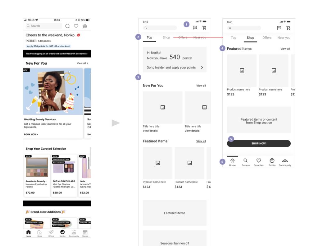
- “Favorites” has been moved to the bottom menu, and only two menu icons remain here.
- So many things and contents happen depending on the season on the current homepage. I added four tab menus at the top so users can reach the information they are looking for. “Offers” shows the same content as the current app, and “Near you” is the same as the current “Stores.”
- The contents change all the time, so I left them as they are now.
- While the top page has mixed content from event information to articles, the shop section can only have information related to products.
- A CTA button has been added here to link to the product page in the “Browse” menu.
- There are currently six menus on the bottom; however, some could be combined or given a different flow. Therefore, I have recategorized them and created five navigation menus here: Home, Browse, Favorites, Profile, and Community.
- “Offers” and “Stores” have been removed from the current menu. Instead, those contents have been added to the home page tab menu and the product section on the “Browse” page.
BROWSE > SHOP > PRODUCT
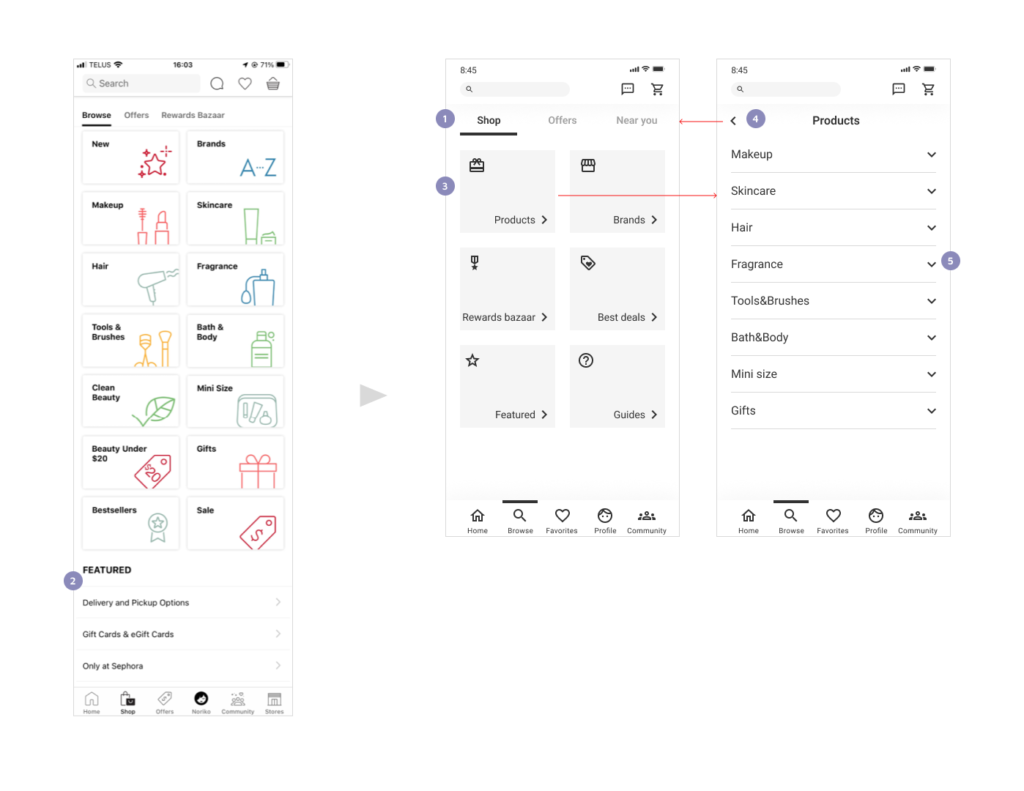
- I changed the name of this page to “Browse” to include both products and event information happening near the user’s location. “Stores” has been removed from the current bottom menu and brought here with a new name “Near you,” as it is about events and services near the user, not only about the location. Also, “Shop” and “Stores” could be confusing because of the similar names.
- In the current app, different kinds of information are mixed in “Featured,” from guide articles to featured products. Moreover, this content is hidden because the page gets long. The deals information could also be difficult to find below a lot of category buttons. Therefore, I organized them and created new categories, such as “Best deals” and “Guides.”
- I reallocated all the categories like this. Those six categories will have a name and an icon. “Rewards Bazaar” has been moved from the current tab menu to here as a category. There are still some other entrances to link to this content. By tapping each category, users go to a new page that shows all the options.
- Users can go back to the previous page by tapping the arrow.
- By tapping the arrow, it collapses and shows the subcategories on the same screen.
BROWSE > SHOP > PRODUCT > MAKE UP
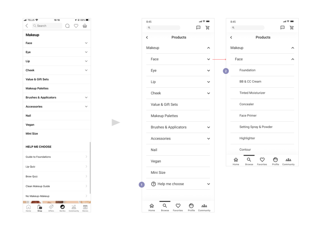
- I added an icon to this menu to catch the user’s attention, and it has been applied the same structure as others, which means it collapses. Also, this content will be shown in the “Guides” menu as well, in case it could be hidden after so many product lists on the page.
- A Category with no arrow links to a different page that shows the product list, same as the current app.
BROWSE > SHOP > GUIDES
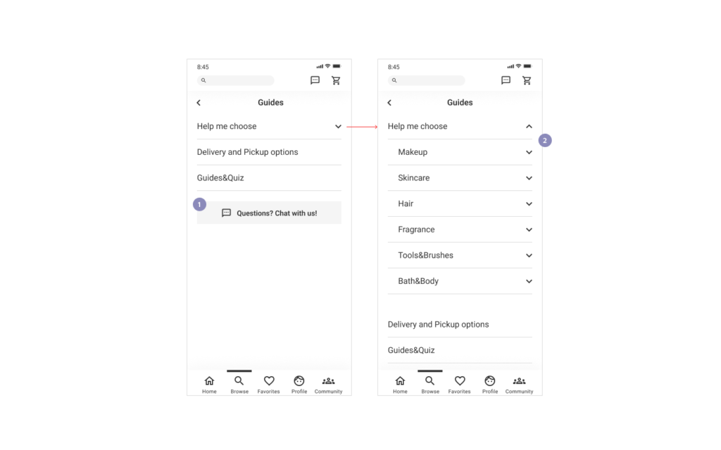
- This is newly created content in this redesign project. Additionally, I added a link to the live chat here.
- In the current app, this information is only inside each product page, below all the product lists. I put it here too, so it’s not hidden.
PRODUCT DETAILS
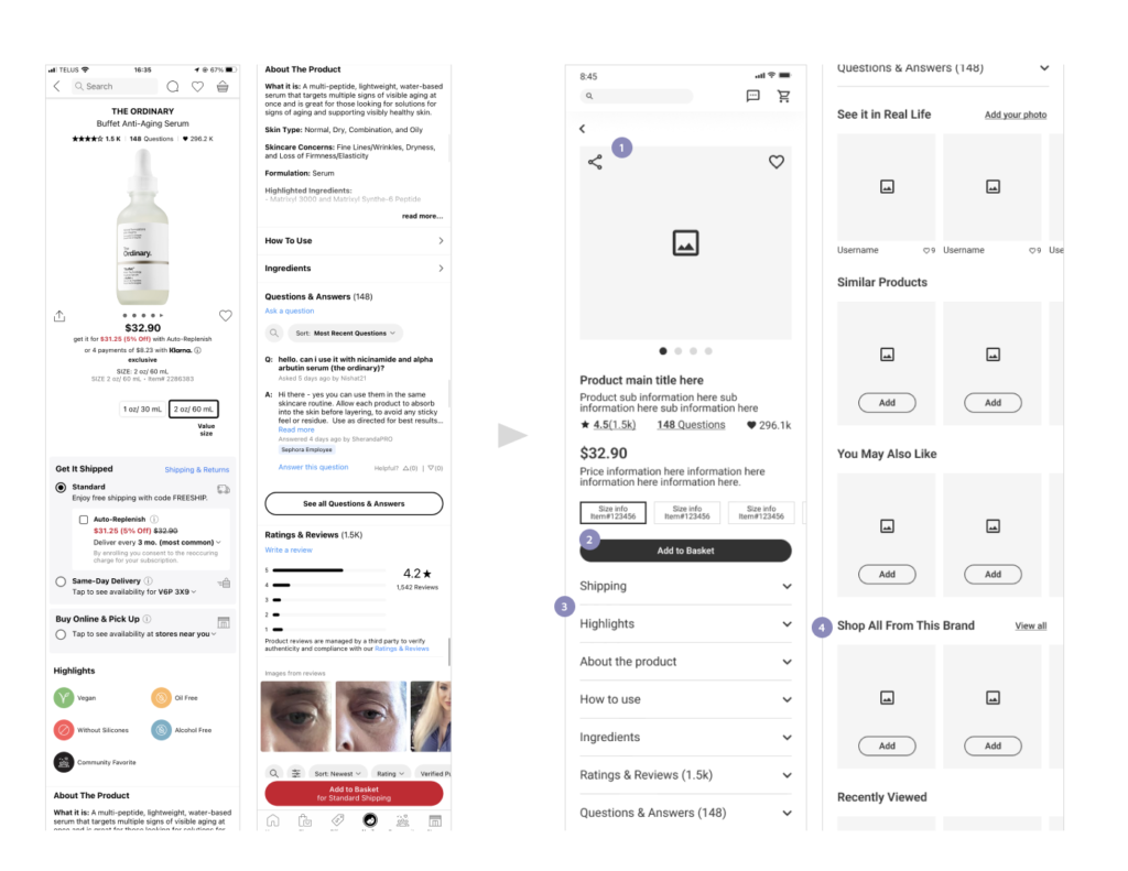
- The current layout looks a little bit disorganized, mixed with photos and text information. To organize them, the photo section is placed first with “share” and “favourites” icons, and the other text information comes after.
- The CTA button is sticky while scrolling, the same as the current page.
- In the current screen, there are many sections with different structures; some reveal information on the same screen, some need to be tapped to reveal additional contents. In addition, some sections have a large amount of information, and as a result, the page gets extremely long. Also, some sections link to another page to show the details, even though they have a very small amount of information. Moreover, there is no clear border between each section, which might confuse users. I made them easy and simple to view with consistency in their structure by showing only each title first, which collapses and reveals the content.
- Somehow, only this section has a different structure from others in the current design, so I applied the same style for less confusion, which shows some carousel images and a link to view all.
PROFILE
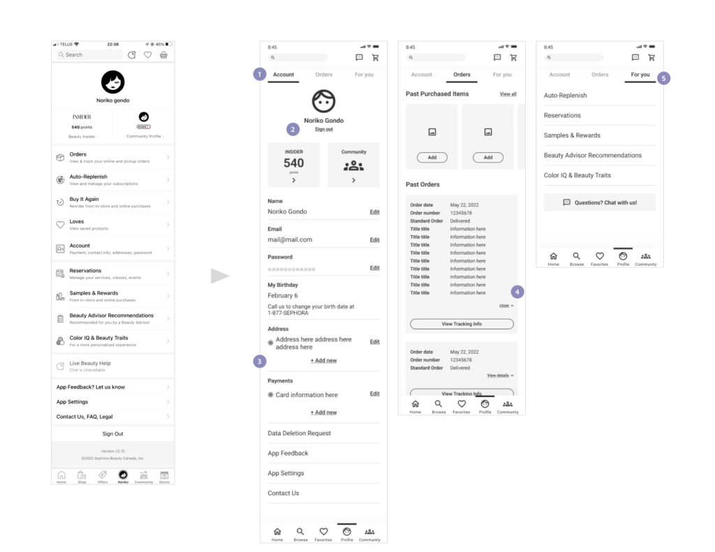
- The current page has a variety of information, which could be confusing. Therefore, I created three tab menus to categorize the contents into an appropriate place.
- “Sign out” does not need to stand out, but it could be a little more straightforward. In the current page, this option is hidden at the very bottom of the long page. Therefore, I placed it here in a small-sized font.
- “Addresses” and “Payments” currently link to a new page. However, considering the amount of information, I revealed the content on the same screen, like the other sections such as “Name.”
- Similar to 3, the details do not need to have another page. They are collapsed on the same page by tapping “View details.”
- The rest of the contents are about personalized services for the user, so I put them in a new category called “For you.”