LURE – UI/UX Case Study
- UI/UX design
LURE, one of Vancouver’s top hair salons, boasts a reputation for providing high-end services and luxurious experiences to its clients. However, their website failed to reflect this brand image and was in need of a revamp. As a UX/UI designer, I took on the challenge of addressing the website’s current issues and developing a solution that would improve its layout, user experience, and consistency. In this case study, I’ll share my design decisions and insights, outlining how I approached the project and transformed the website into a visually appealing, user-friendly platform that reflects Lure’s brand image and reputation.
Current website
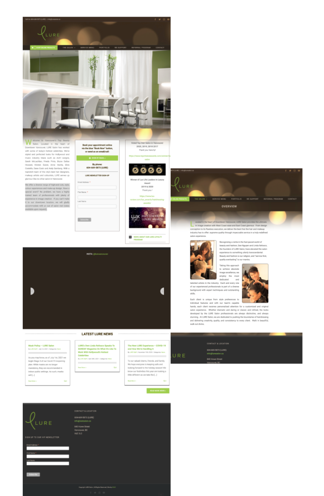
Structure/Layout
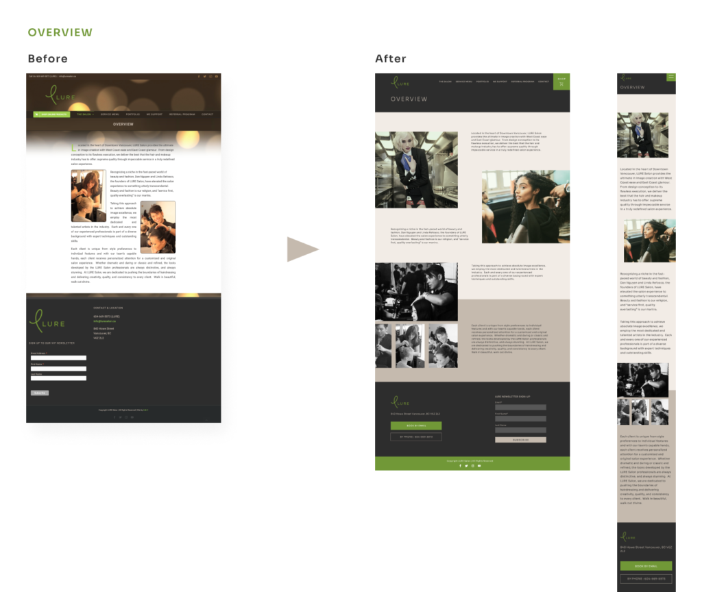
The current website layout may benefit from a more streamlined approach to the header, as the sticky header’s size can be a bit overwhelming for users. Additionally, the three-column layout of the body content may benefit from a more modern design approach, as it may appear cluttered on smaller screens. Lastly, the footer could be optimized to make better use of the negative space on the right side.
UX Experience
The website’s hero image features many photos, but it may not be immediately clear to users that the images can be navigated by clicking the side arrows that only appear when hovering over the section. Additionally, the Instagram feed on the website is currently not functioning as intended.
Consistency
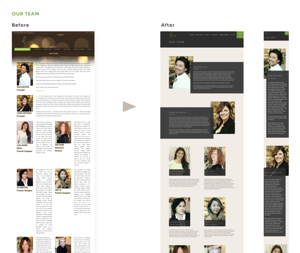
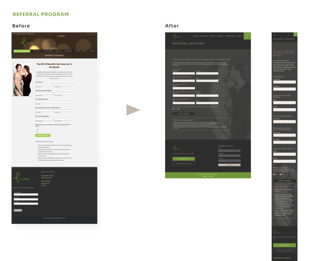
The current website may benefit from a more consistent design approach, as there are some discrepancies in the colour and scene of the photos used. For example, the green used in the buttons and text appears much lighter and even neon in comparison to the logo’s green, which may not align with the desired brand image. Furthermore, the body content area on the inner pages of the desktop version could be widened to better match the home page.
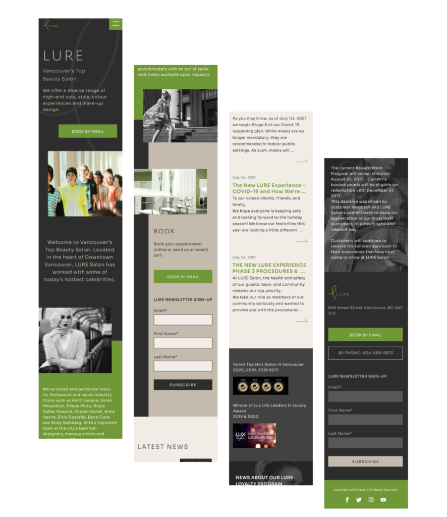
My solution
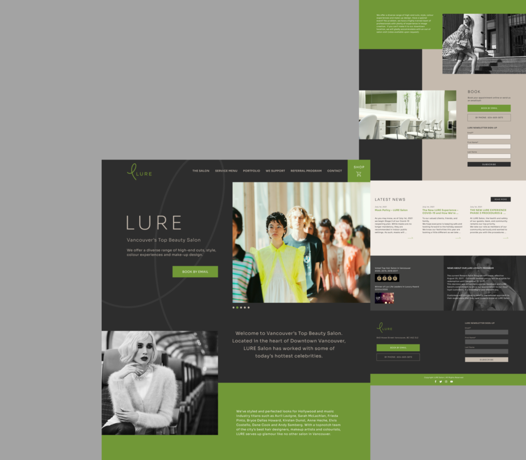
Improved Layout
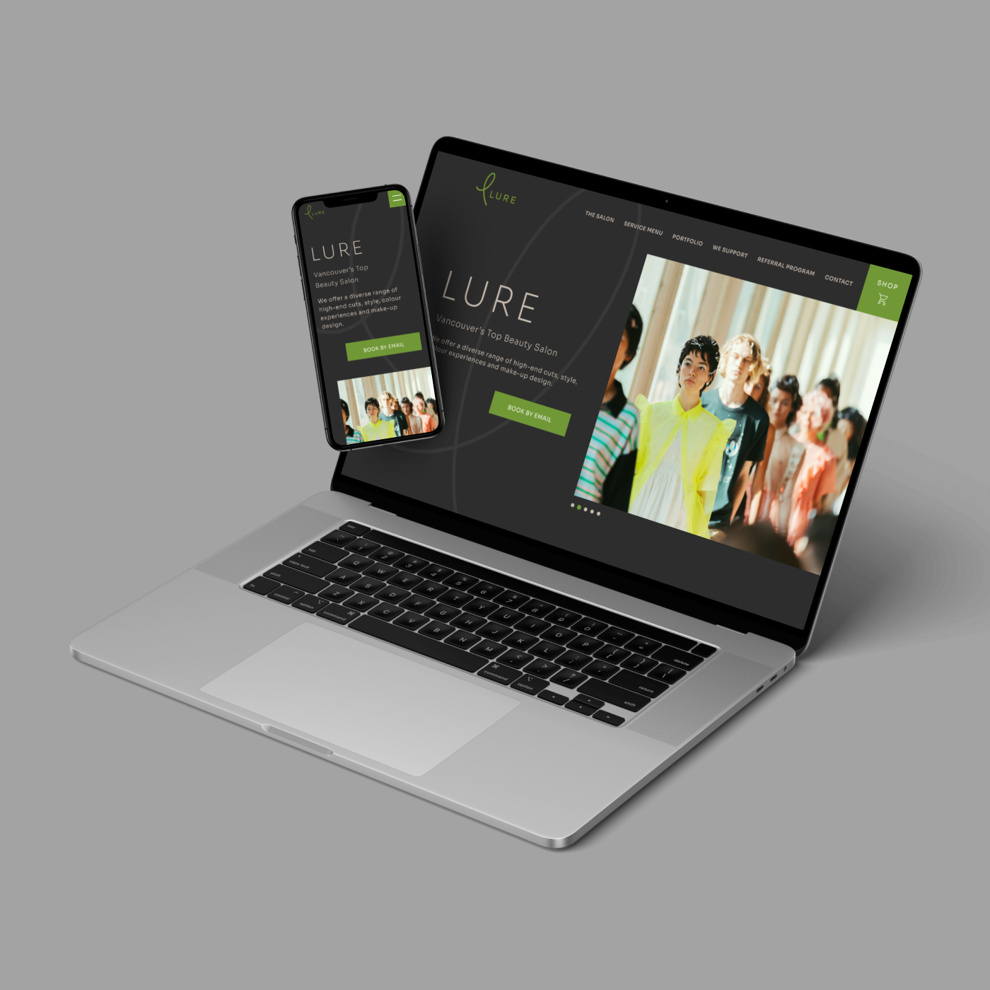
To improve the website’s layout, I opted for a simpler and cleaner design for the header. I emphasized the link to their shop and removed any distractions that could disrupt the user’s experience. For the body content, I replaced the three-column layout with a more modern and user-friendly single-column design that showcases some of the salon’s photos that were previously hidden in the hero image. Lastly, I organized the footer information to eliminate any unnecessary negative space and make it easier for users to find the information they need.
Organized UX
To improve the website’s UX, I selected a photo that matches the salon’s branding colors for the hero image and added dots to indicate that more photos are available to view. I removed the redundant Instagram section and instead dedicated more space to the booking information and newsletter signup form, making it easier for users to take action. This change helps to streamline the website’s functionality and provide a more enjoyable user experience.
Increased Consistency
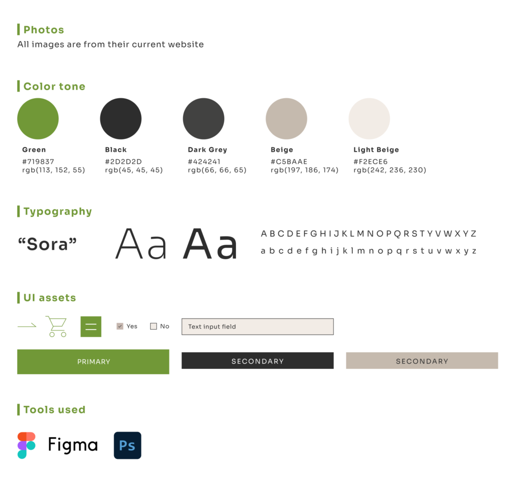
To create a more cohesive and visually appealing website, I adjusted the color of the photos to match the overall design. I used only the green from the salon’s logo to create a more luxurious feel that aligns with the salon’s reputation as Vancouver’s top salon. Furthermore, I designed the inner pages with the same consistent elements and vibes to ensure that the user’s experience is consistent throughout the website.
Branding
Inner pages