

myMomentum – UX Case Study
- UI/UX design
Are you looking for a wellness app that motivates you to take small steps towards a healthier lifestyle? Look no further than myMomentum, a Vancouver-based app that offers daily challenges and snack boxes to help you stay on track. While the app’s UI is clean and straightforward, there are a few areas that could be improved to ensure a seamless user experience.
Specifically, users may find themselves confused by certain word choices and indicator symbols, and the limited reward options could leave them feeling uninspired. Additionally, the current system of emailing reward details can be cumbersome and disjointed.
In this UX case study, I will explore my process for improving myMomentum’s navigation and user flow while offering more reward options to keep users engaged and motivated.
Current screen
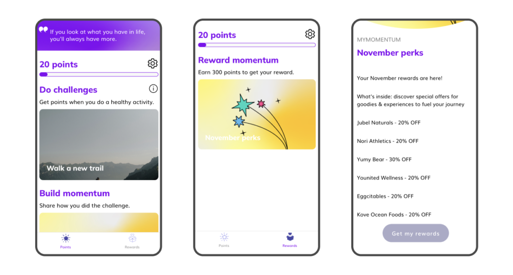
Problems to solve
1, Confusing navigation
2, Confusing point indicator
3, Limited option for reward
My solution
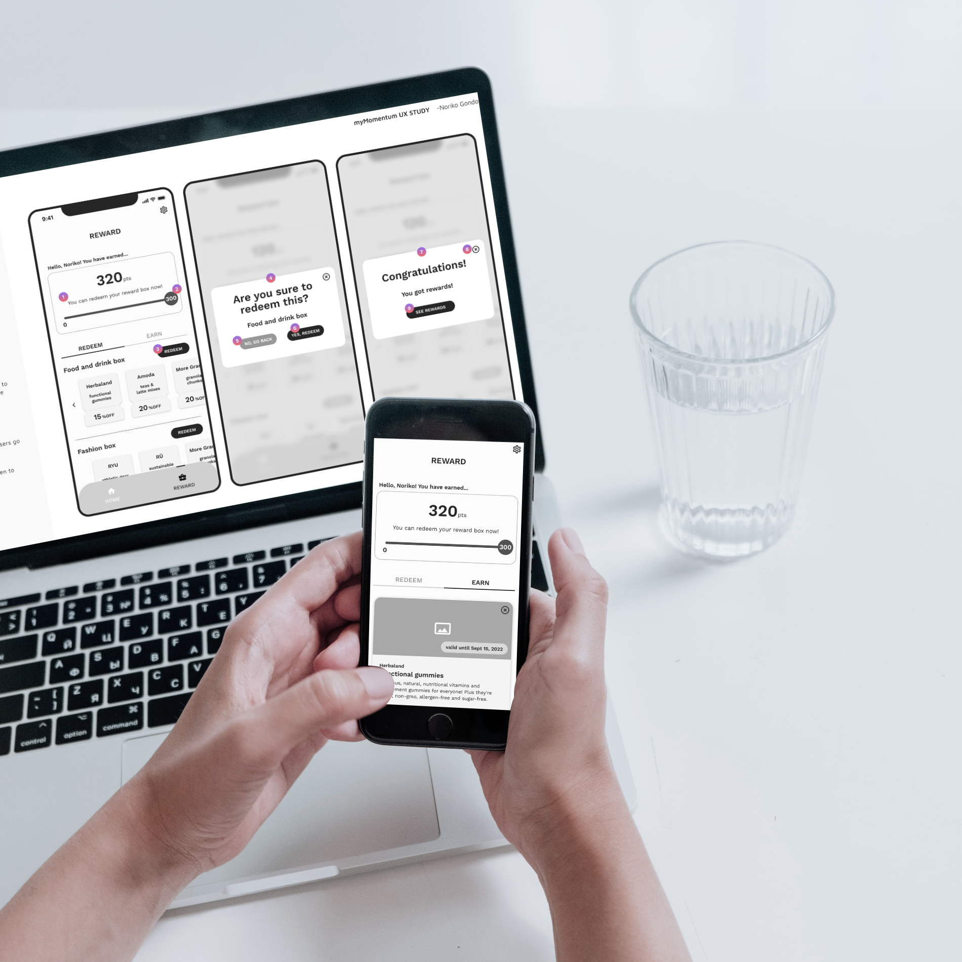
REWARD
– REDEEM without enough points –
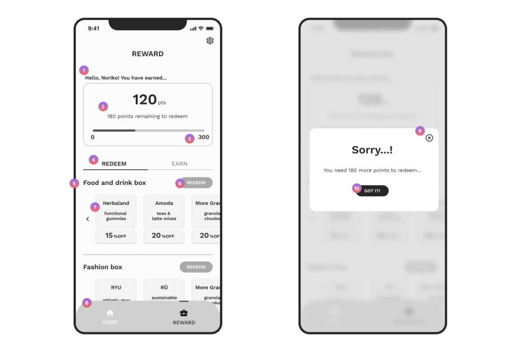
- Users can see their name, which adds friendliness.
- It shows how many points users need to earn a reward, in addition to the bar graph.
- It should display the end point. (The current app does not have it.)
- This is a tab menu. The default tab is “REDEEM,” where users can view all reward box options.
- The name of each reward box is displayed, and users can choose a box that meets their needs.
- Until users reach 300 points, the button will be grayed out. However, they can still click it, and a modal message will appear.
- Users can view the content of each box to make it easier for them to select what they like. The content card is not clickable.
- Since the user’s point is also displayed in “REWARD,” the current menu title “Points” has been changed to “Home,” with only one feature to complete the day’s momentum. Additionally, “Reward box” has been changed to “REWARD” to have only one word as a menu title.
- Users can close the modal by tapping here.
- Similar to 9, users can close the modal by tapping here.
REWARD
– REDEEM with enough points –
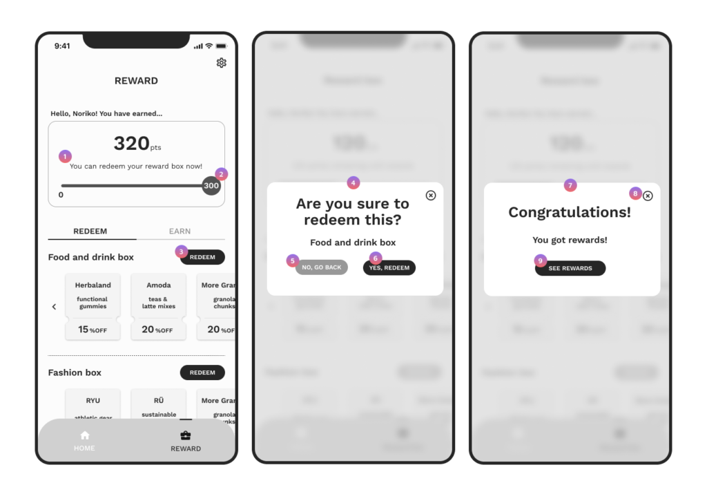
- It provides clear written information that informs users they can redeem a reward box.
- The end point is highlighted so users can easily see when they have reached their goal.
- Now the button looks active. By tapping it, users get a modal screen (4).
- This step allows users to confirm if they want to redeem their reward.
- By tapping this, a modal screen (7) appears.
- By tapping this, the screen closes and users are taken back to the previous screen, just like when tapping the cross icon on the top right.
- Users can see that the reward is now unlocked.
- By tapping here, the modal is closed and users are taken back to the “REDEEM” screen.
- By tapping here, users are taken to the “EARN” screen to see what they have redeemed.
REWARD
– EARN –
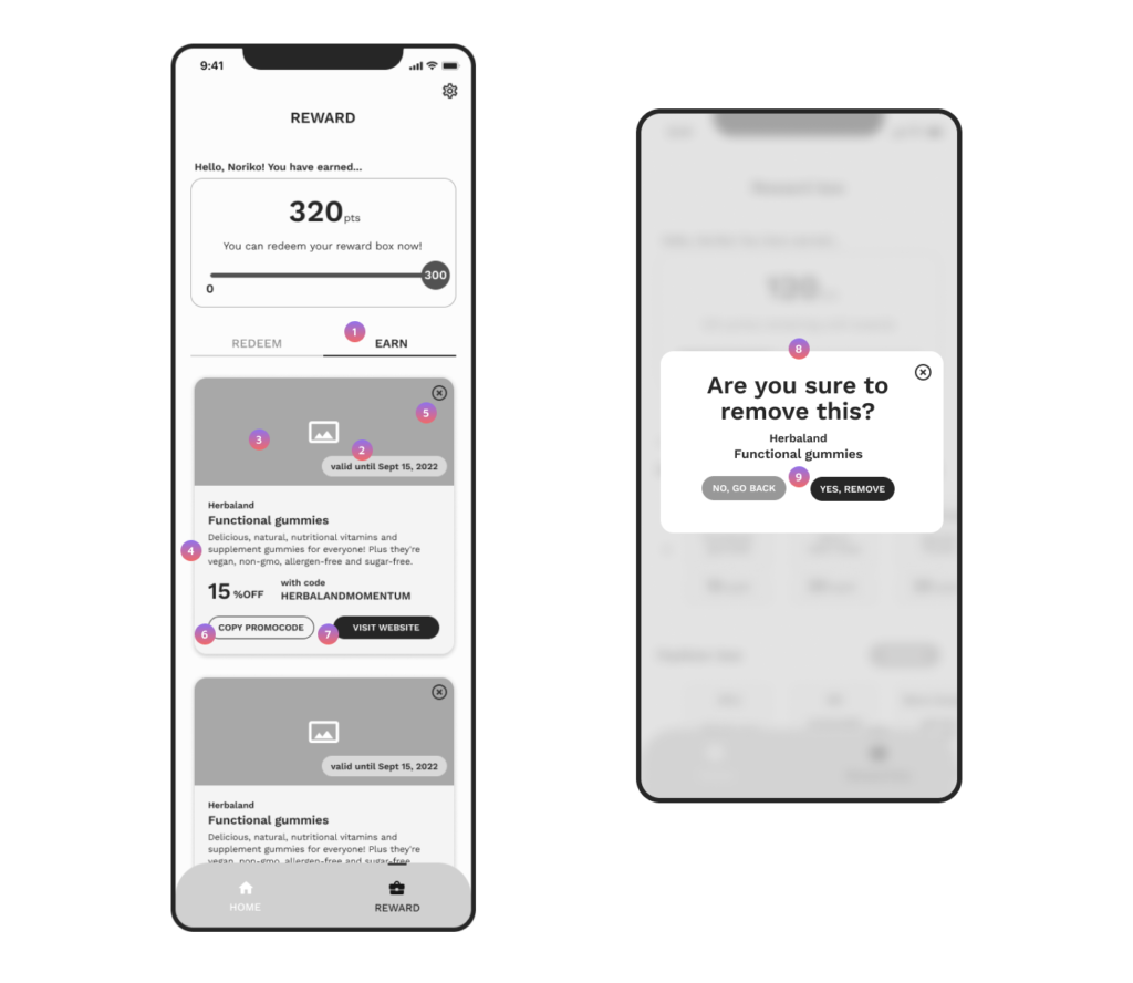
- By tapping this tab menu, users can view the list of reward box content they have earned so far.
- It displays the expiry date. When the date arrives, the card will disappear.
- It displays an image or photo of the product.
- All the information about the reward, such as the brand, product, and deal information, is shown here.
- By tapping this, users are taken to modal screen 8, where they can remove the card from their EARN list. However, it doesn’t mean users lose the reward. They can always access the reward information from their email because they also receive the information by email.
- By tapping this, users can copy the promo code.
- By tapping this, users can access the website.
- Users can take one step to confirm if it’s okay to remove the card from their list.
- After selecting either option, users are taken back to the “EARN” screen. When a card is removed, it is deleted from the list.